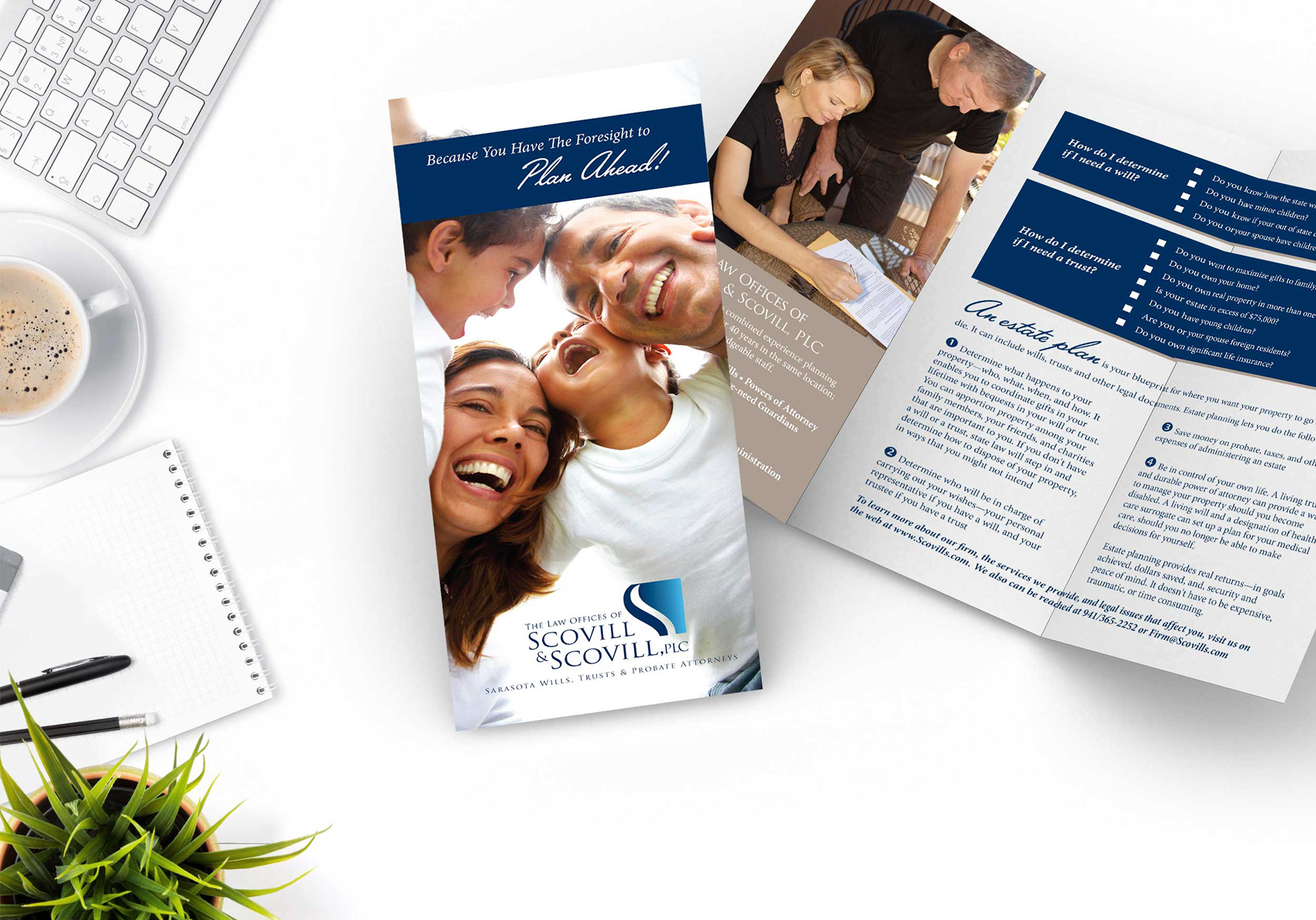
One of the first questions I asked Bart Scovill when I met with him to create a logo was why it was important to have a well-designed professional looking logo. He said it came down to one word and that is TRUST. Trust separates and promotes you in the eyes of your customer. Trust keeps long-term relationships. Bart Scovill, PLC, Sarasota Wills, Trusts and Probate Attorney (formerly The Law Offices of Scovill and Scovill, PLC) is a small firm, who specializes in Estate Planning, Probate Administration, and Business Law.
When we looked at many of the competitors’ logos, we noticed a consistent pattern of using typical imagery of blind justice, scales and/or gavel. When you use clip art on your design, one of the major disadvantages is that it can look like a duplicate of a previous design. This will compromise authenticity and without authenticity you do not have trust. Your logo needs to be unique and exceptional, targeted only for your business. Mr. Scovill wanted to stand out amongst those in his field. In addition to researching his closest competitors, we also talked about his location and relationship to the community. His firm is well respected, and he is a trusted resource in the community.
When I gathered all of this information, I started the design process by applying everything we talked about into a visual format. I focused almost exclusively on the illustrated "S" that would stand as an illustrated icon alongside the text part of the logo. I followed a natural blue two-tone that came to me indirectly after researching the Sarasota, FL market and its beautiful waterfront location. The firm is well known in the Sarasota community and that color choice helped guide those colors. I also made it a priority to only use two blues in the logo that harmonize well together. I did not want the logo to be overly-designed but yet wanted it to be bright and impactful. Also, by developing this icon, it would act as an anchor point for various other business marketing materials.
After developing this icon, I began to work on the font. After several considerations, we decided to go with a font that not only matched the feel of the icon; but also, could easily be changed. It was important to incorporate flexibility into the logo. When I first created this logo, the firm was called The Law Offices of Scovill and Scovill, PLC but today it is called Bart Scovill, PLC. Since we went with a common font used on most computers, Bart had the flexibility to continue to use this logo for many years to come.
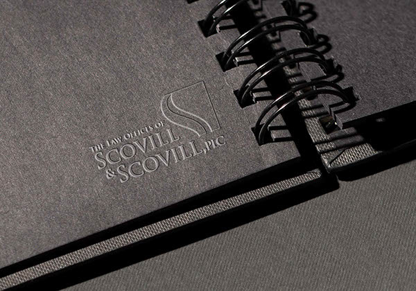
Stationary

Golf shirt

Coffee Mug
